
AI Data Visualization – The New Frontier
Kelly Cutler


Innovative designs of 2024 will be marked by designers embracing AI, accessibility, and hybrid styles to redefine how users interact with digital products.
Design reviews help ensure your carefully envisioned designs are implemented precisely as they should be. We take you through the process.
Our UX team shares 10 New Year’s resolutions for creating amazing experiences in 2024 and beyond.
Make your digital product user-friendly for all types of users by incorporating the four main principles of accessible design through eight practices.
Exploring different approaches to creating interactive prototypes in Figma so you can see your static design come alive before development starts.

Our Head of Experience Design Shannon Ruetsch explains the importance of empathy in understanding real user needs.

A lack of formal education is no obstacle to pursue your dream career. Find out how to get into UX/UI design with no experience.
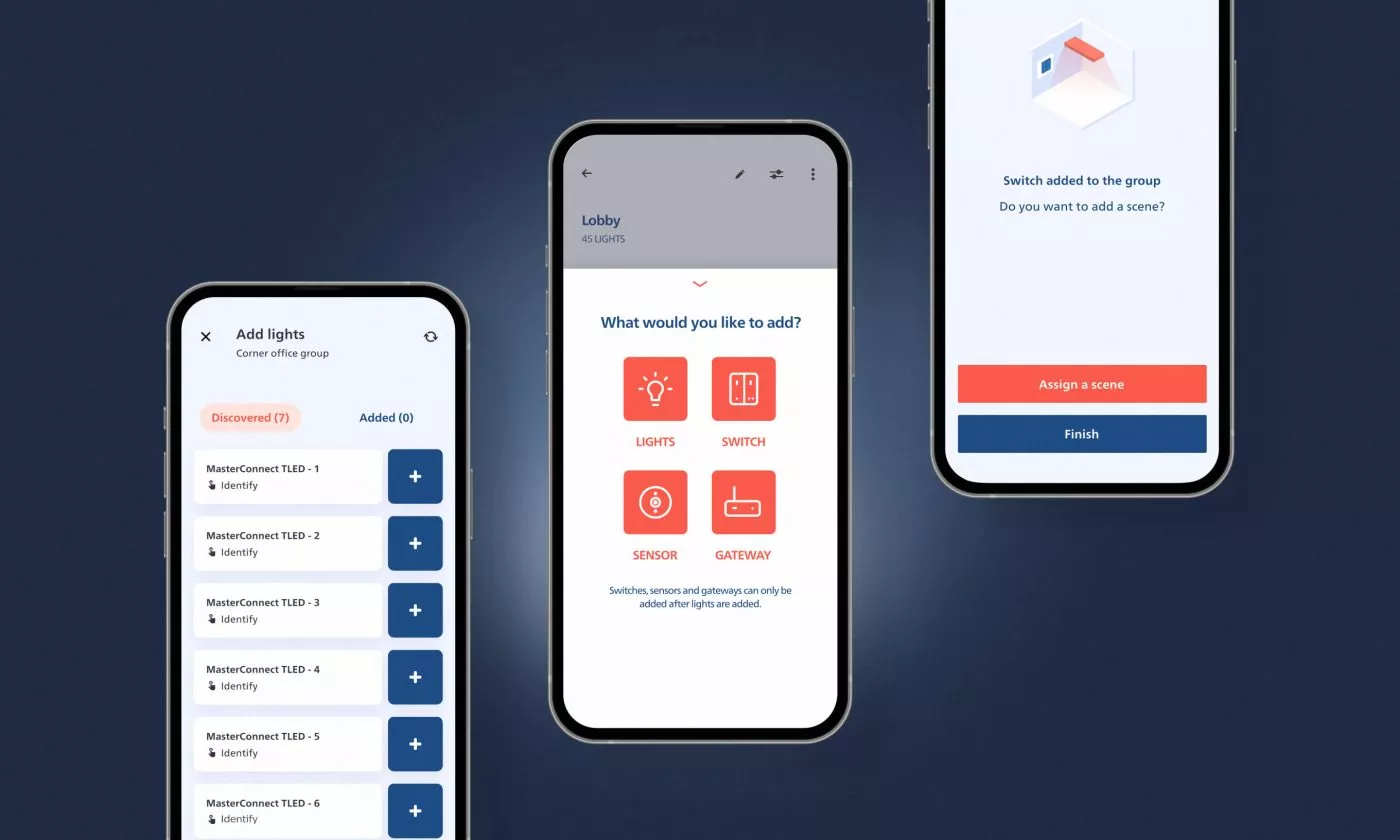
How we tackled IoT app design on Philips MasterConnect, the core tool for setting up and configuring smart lighting networks in commercial buildings.

We present the principles we’ve identified as key to shaping inclusive and accessible experiences for older adults and their caregivers.

Misaligned expectations can make conversations about design difficult and impair a project's progress.
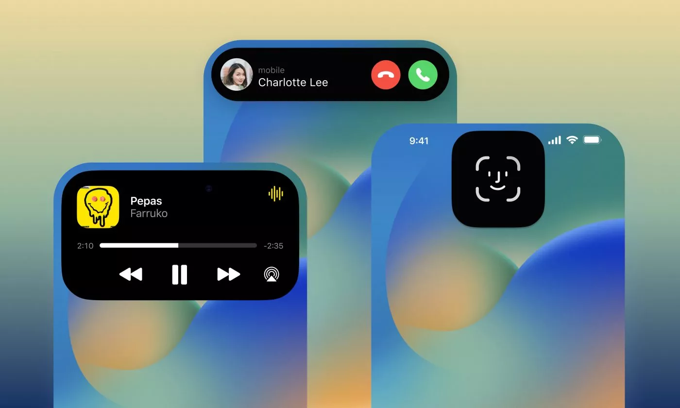
Whatever your opinion about Apple's Dynamic Island may be, it is a UX renaissance in the making and designers need to take it into account.

Auditing the accessibility of the websites we make by using our keyboards and screen readers is easy and helpful, and we explain how to get started.

Online rating systems are a way of publicly reviewing a product or a service. This way, users shape the total sum of perceived quality.
An ideal workflow for easily creating multiple flavors for apps that can be utilized for different brands or industries.
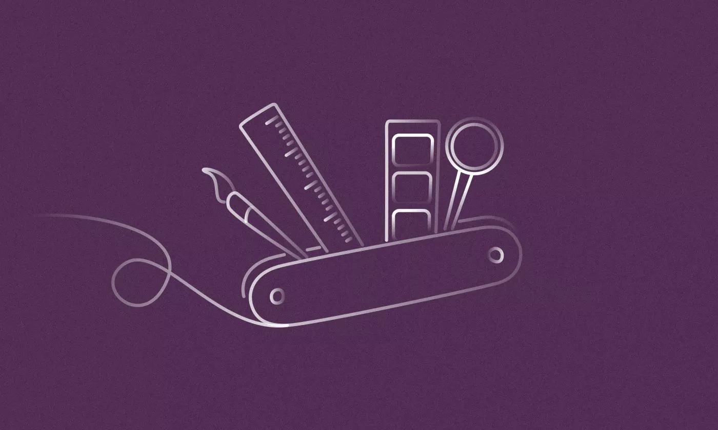
If you're looking for a feature not covered by Figma's basic tools, or you want to speed up your workflow, reach out for Community plugins.
A list of lesser-known psychology insights to boost your UX, applicable right away.

As I found out, Affinity Designer is a worthy rival to Adobe's sacred trinity for designers: Photoshop, Illustrator and InDesign.

The principle of "surprise and delight" helps companies set themselves apart in a crowded digital space and foster brand loyalty.
Find the ideal compromise between flexibility and usability by identifying what must exist, what should exist, and finally what can exist.