


Redefining a telecom customer journey with a powerful all-in-one app
A1 TELECOM
We made omnichannel a reality for A1 with over 60% customers using the mobile app.
SERVICES
STRATEGY
USER TESTING
UX DESIGN
UI DESIGN
MOBILE ENGINEERING
ANALYTICS & GROWTH
QUALITY ASSURANCE
PROJECT INFO
Delivering personalized service at a scale
With its superior telecommunications service offer and a bold business strategy, A1 is actively pursuing digital transformation with a ripple effect across the entire organization.
They partnered with us to create an end-to-end digital experience that delivers personalized service to a wide segment of consumers, with mobile as the primary communication channel.
A1 STANDS FOR AGILE
A1 leads digital transformation in the telecom sector. Working in an Agile environment and according to the Scrum methodology was a given.
Validated by real users
Strategic discovery workshops preceded the design phase. We worked with the A1 customer experience team to polish the product’s value proposition and ensure we deliver exceptional customer service. We kept reverting to three simple guiding principles – A1 customers must always be informed, connected, and carefree.
While ideating, we started each brainstorming session with a simple question “Who will be using this particular feature, and how do we want them to feel?”. Each feature was validated by conducting extensive user tests and through focus groups, where we observed behavior, interaction, and perceived user value.

THE SOLUTION
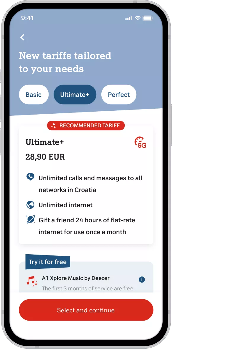
Personalized, transparent,
secure
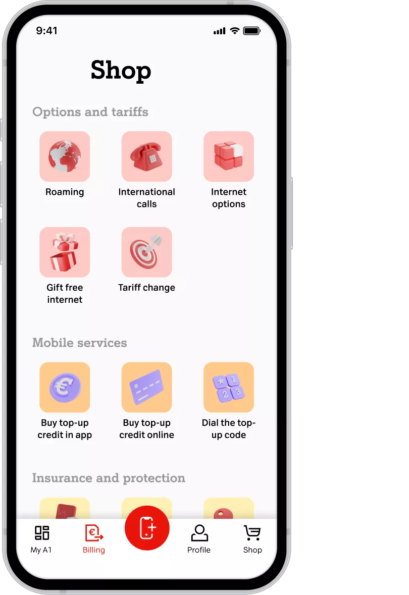
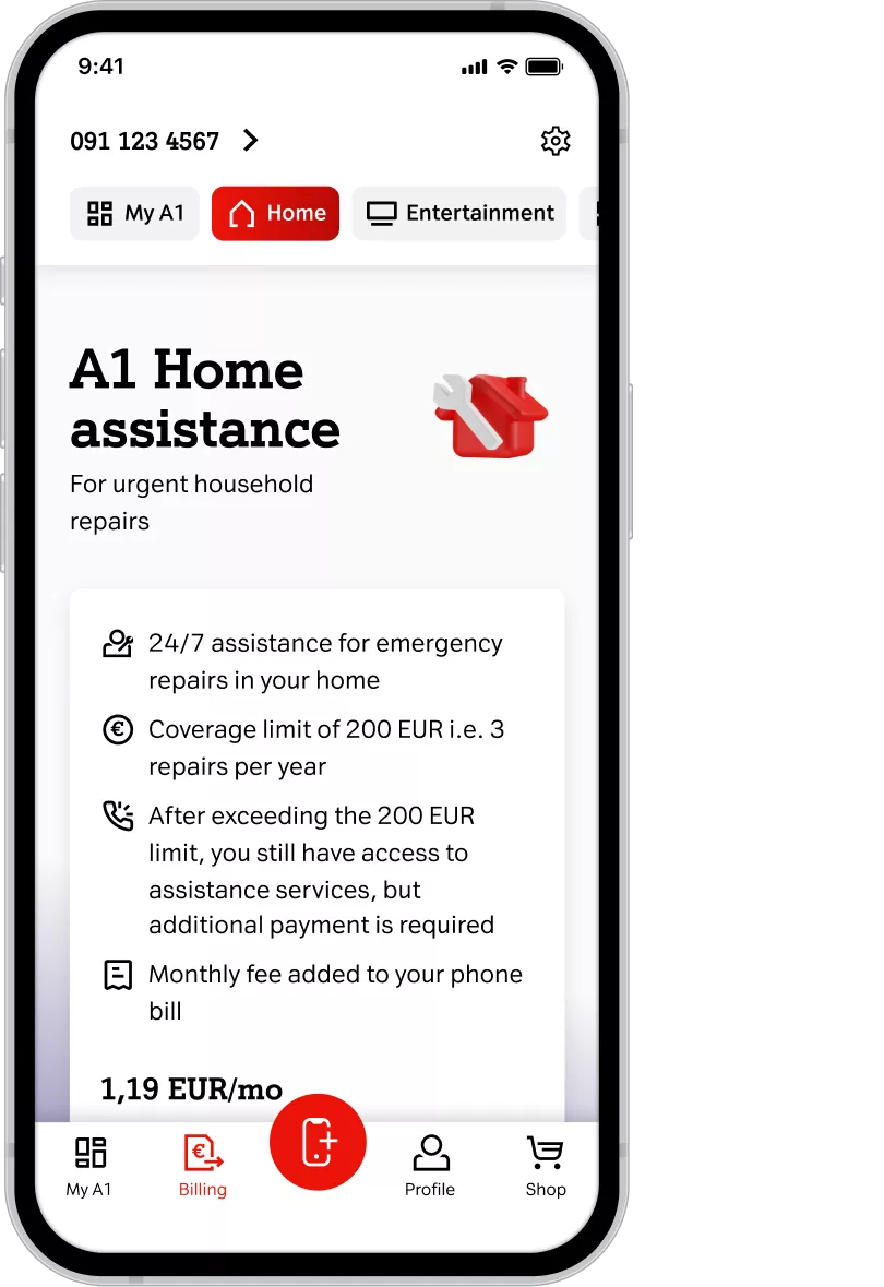
Modular app architecture allows A1 to deploy relevant and contextual content. Services, features, and options adapt to match the customer’s profile and needs.
The smartphone app contains all the UI elements, while the logic and data are handled by the backend. The app itself doesn’t have direct access to the database, providing an additional layer of security. Instead, A1’s CRM is responsible for orchestrating personalization and data delivery.
We employed server-side rendering to achieve the level of personalization that’s on par with A1’s standards. The application uses the MVVM (Model-View-ViewModel) architecture that’s modular and scalable.
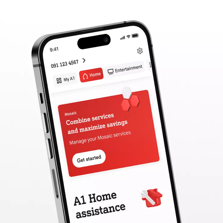
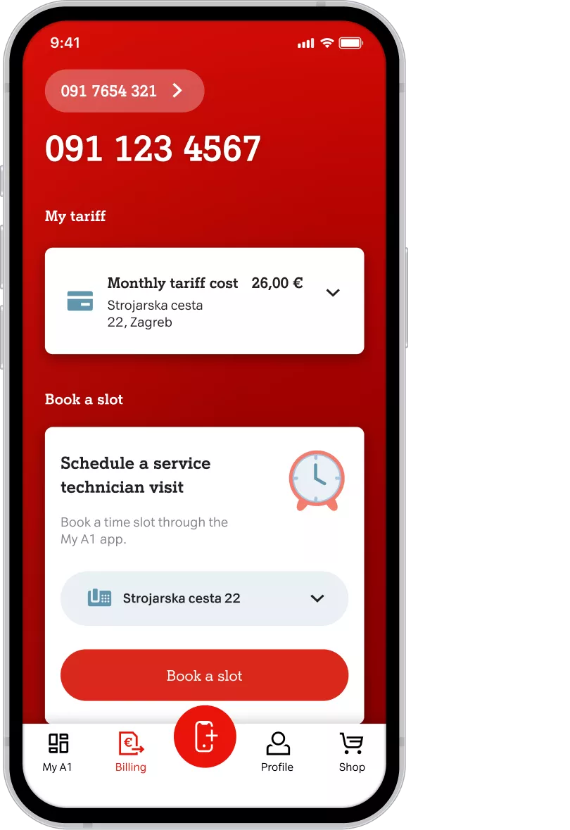
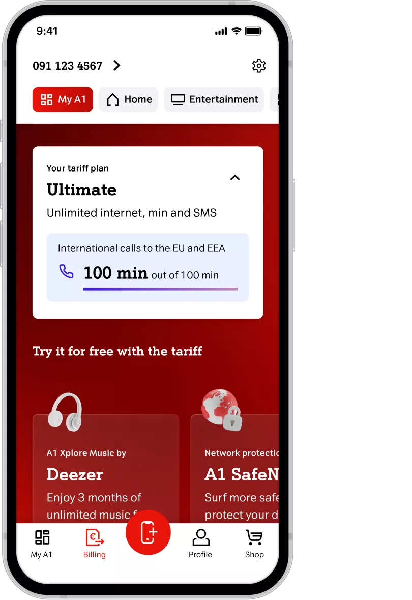
Dashboard at a glance
The A1 app is the ultimate touchpoint where customers can get a clear picture of the information they care about.

Options to match each customer’s needs
Thanks to modular architecture, the A1 app can adapt to each user and show services, features, and options that match their needs.

The adaptable and personalized A1 app experience is casual, engaging, and always on-brand.
A1 is continuously evolving. The mobile app reflects that by following four underlying principles.
1
Flexible information architecture
2
Scalable design system
3
Server-side rendering
4
Engagement and gamification

PEOPLE FIRST
In a series of in-depth interviews, we asked the users about their spending habits, how they interact with A1, and how they solve telecom problems.
Takeaways
and results
Transparency, commitment, and a clear common goal were critical to the project’s success. Even though we are two teams working at two different companies, the joint mission was achieved – to deliver world-class functionalities to users. With each new iteration, A1 keeps on delivering exceptional results and unprecedented user engagement.